





Wai Wai City – Global Style Guide
OVERVIEW
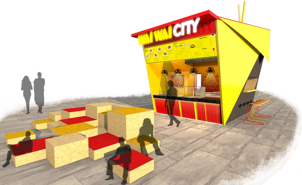
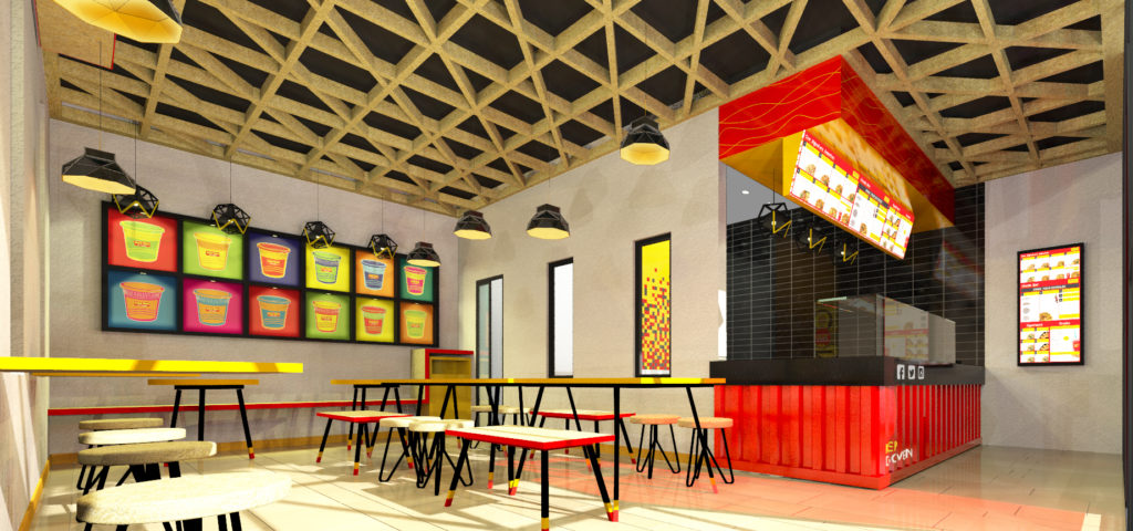
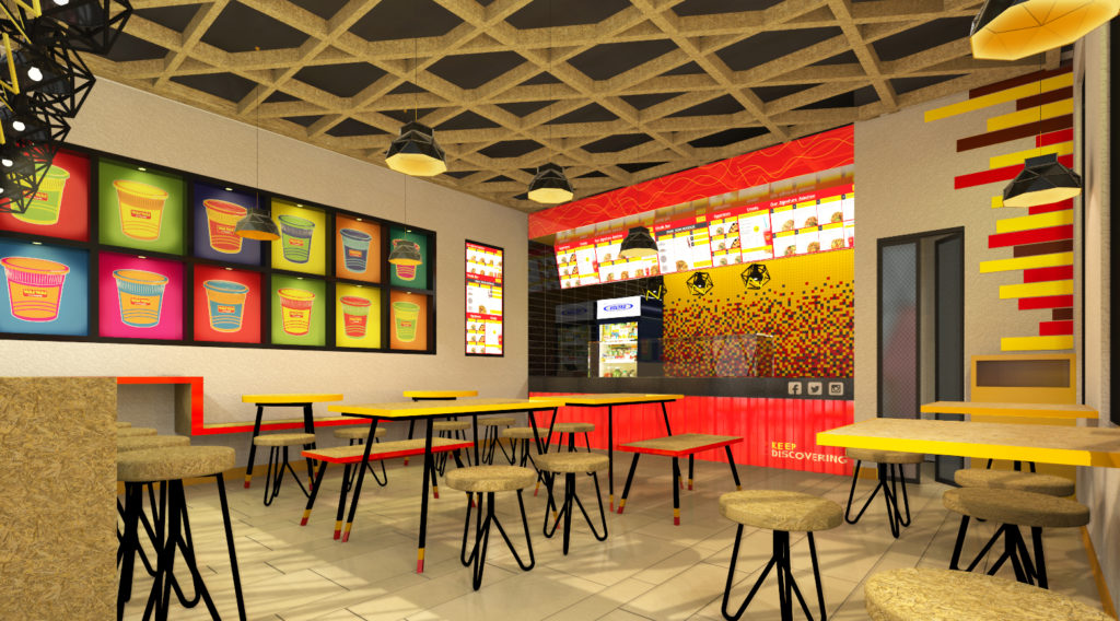
Wai Wai City celebrates an eatery that serves noodles in a comfortable informal seating, a setting which feels and is accessible to all cadres of society, where the outlook of the project does not depict or is least suggestive of any certain style or form of interiors. They put forward guidelines where the interiors should be bright, lively and reflective of the brand ideology, that is- affordable food, experimentation and flexibility. The interiors would reflect a sense of community and equality.
• A conscious decision was taken to use elements in their most basic colours and enhancing their presence by adding colour accents resonating the brand identity.
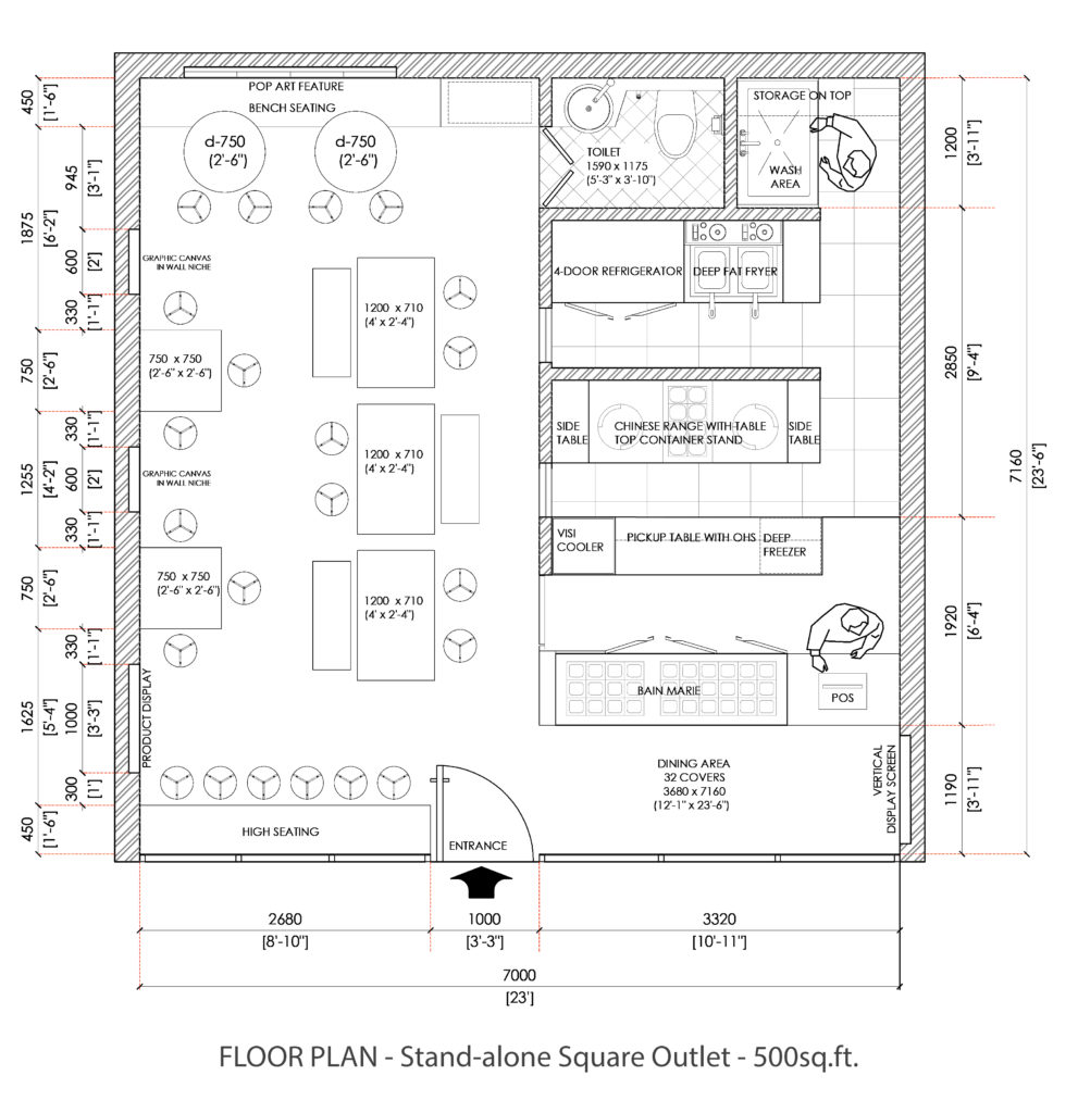
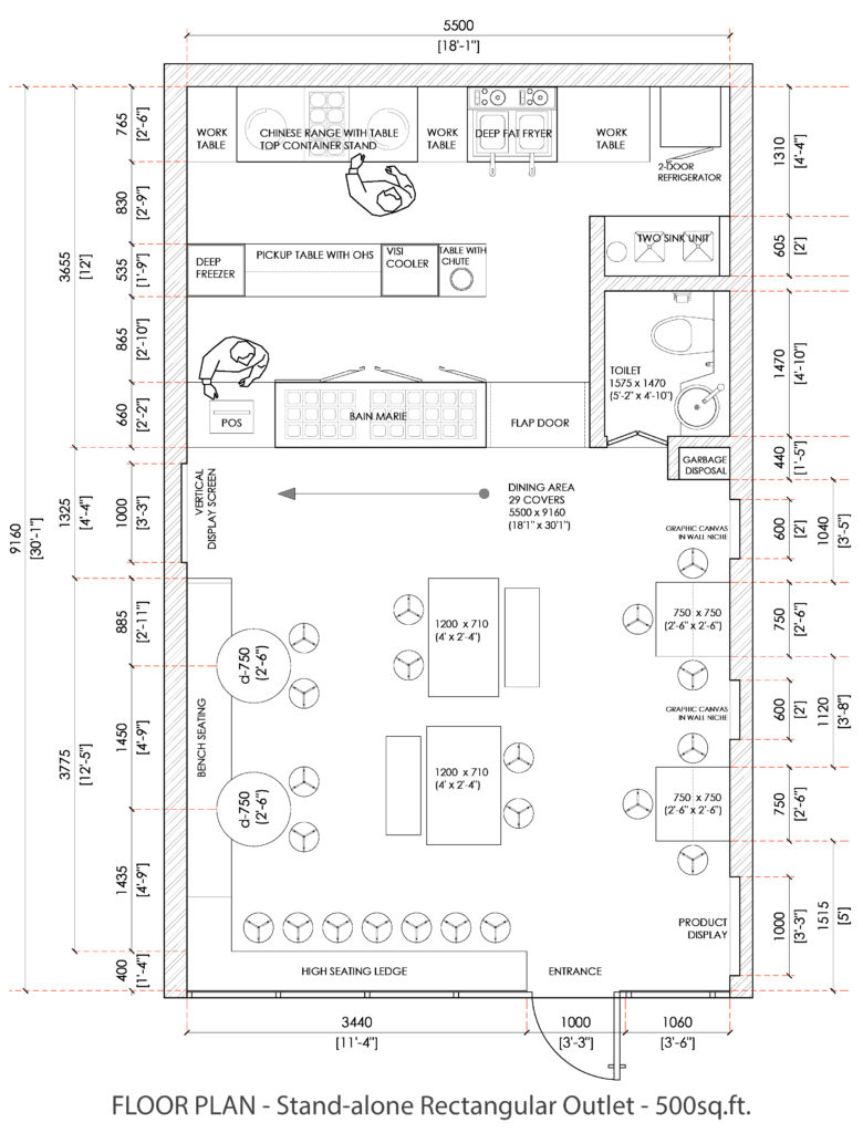
• The rush of feelings, colours, texture and aroma of food experienced in a single moment expands over an area as less as 150 sq.ft. to a maximum of 1500 sq.ft, creating a lively and inviting environment, detaching it from the city outside and providing a quirky tangent to the contemporary design elements.
• The materials used had to be easily available and replicable across India. Strand board
and cement board in their most basic forms, are close to nature and have fewer quality variations. Most importantly while complementing each other, they also balance out the compelling brand colours, giving the space a warm tone throughout.
• Following the thought process of using elements in their basic colours, the flooring is also portrayed as a rough grey colour, resembling natural materials. The flooring has also been set as a dynamic element, giving it a chance to change naturally with due passage of time.
Year
CATEGORIES
Architecture,Retail / Leisure